
Nasonex
What are you looking at?
UI/UX design for Nasonex, this is an allergy monitor app focused on improving the user experience by integrating features that allow users to track their local pollen count, monitor their allergy symptoms, and log when they take their medication. This app is not only functional but also helps expand the Nasonex brand recognition by aligning with its established branding.
My Role
Visual Designer, Creative Direction and Senior Designer
Tools I used
Illustrator, Esko (3D Software), and Figma
Final Deliverables
Print and UI/UX assets

Key UX Design Principles:
-
Simplicity: The app’s layout is clean and minimalistic, with large, easy-to-tap buttons. I focused on presenting content in an organized way, making sure the app is intuitive for users of all levels.
-
Accessibility: I paid close attention to contrast, ensuring that text is legible and that the color scheme is suitable for users with varying visual abilities. I also made sure the app is responsive and mobile-friendly.
-
Personalization: By greeting users by name and showing them customized pollen forecasts, symptom tracking, and medication reminders, I aimed to create a personalized experience that keeps them engaged with the app.
-
User Engagement: The inclusion of local pollen data and personalized discounts encourages users to check back regularly, fostering loyalty to both the app and the Nasonex brand.
Overall, my goal was to create an app that provides real value to users while reinforcing the Nasonex brand. The design empowers users to manage their allergies effectively, ensuring that the app becomes a useful, daily tool for anyone dealing with seasonal allergies.

Registration Screen
Brand Consistency: The first element I wanted to make sure of was ensuring the Nasonex branding remained front and center. I used the Nasonex gradient color palette (teal to blue) for the background and placed the logo at the top to create brand recognition. This also gives the app a clean, professional look from the start.
User Experience: The registration screen is as simple as possible with only three key fields: Username, Email, and Password. This minimizes user effort to start using the app. The “Register” button is placed at the bottom in a contrasting orange color to draw attention to the primary call to action.
Engagement: I included a “Forgot Password?” link at the bottom to ensure users have easy access to account recovery, which helps in reducing friction and improving user retention.

Login Screen
Brand Consistency: Just like the registration screen, the login screen uses the signature gradient background, reinforcing the visual identity of the brand. The bee mascot from Nasonex is introduced here to give the app a fun and friendly character, aligning with the brand’s approachable tone.
User Experience: The layout is straightforward with clearly labeled fields for username and password, and a prominent “Login” button that contrasts against the background. This ensures that users can quickly and easily access their accounts without unnecessary distractions.
Engagement: The greeting message “Welcome Back!” creates a warm, welcoming experience. The bee mascot further adds personality to the app, making it feel more interactive and inviting, which could enhance user engagement.

Personalized Dashboard
Brand Consistency: The use of the consistent gradient background and clean layout allows users to easily recognize the Nasonex brand. The “Hi Welcome [User]” message immediately personalizes the experience, and the bee mascot continues to build a fun connection to the brand.
User Experience: The dashboard gives an immediate overview of the user’s symptoms and the local pollen forecast. This data is shown through simple, easy-to-understand graphs. Users are provided with both their personal allergy trends and local environmental data, which gives the app its core functionality.
Engagement: I designed the two graphs to display information about allergy trends over time and local pollen trends. These features encourage users to interact with the app regularly to track their symptoms and stay informed about the environment around them. Personalized content, like “Hi [User]”, fosters a deeper connection with the app and increases the likelihood of daily use.
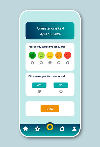
Symptom Logging and Medication Tracking
Brand Consistency: The consistent use of the gradient background and branding in the buttons and text ensures that users know they are still within the Nasonex ecosystem. The color-coded symptom scale (green to red) helps users easily communicate how they feel each day.
User Experience: This screen provides a simple, intuitive way for users to log their daily symptoms. The scale of symptoms (from happy to very unhappy) is easy to use, and the "Did you use your Nasonex today?" question provides a simple yes/no option, making it easy to track medication usage.
Engagement: Encouraging users to log their symptoms and medication usage daily creates a habit. By prompting users with a gentle reminder ("Consistency is key!"), this screen nudges users to engage regularly with the app, ensuring that Nasonex becomes an essential part of their allergy management routine.

Pollen Forecast Screen
Brand Consistency: The clean, professional design uses the brand colors consistently. The color-coded traffic light system for pollen levels (Low, Moderate, High) uses the same teal, yellow, and orange as the rest of the app, helping users quickly interpret the data.
User Experience: This screen gives users a detailed breakdown of the pollen forecast for their specific area. By breaking down the forecast by day and showing which pollen types are most prevalent, users can plan their day and manage symptoms accordingly.
Engagement: By providing actionable, localized information, this screen adds significant value to users, encouraging them to visit the app frequently to check the forecast. Users are more likely to engage regularly if the app serves as a useful tool in managing their allergies.

Savings and Offers Screen
Brand Consistency: The gradient background and consistent button styles reinforce Nasonex branding across the app. The inclusion of local stores (Target, CVS, Meijer) alongside Nasonex gives the user a more seamless, branded experience, while also making it easy for users to access discounts.
User Experience: The "Search your location for savings" bar is at the top, allowing users to easily input their zip code to find offers near them. The offers themselves are clearly laid out with the store name and discount details, making it quick and easy for users to act on them.
Engagement: Integrating savings directly into the app enhances user engagement by offering immediate, real-world value. This encourages users to check back regularly to see new offers, keeping the Nasonex brand top of mind and reinforcing the idea that the app is useful beyond just
tracking symptoms.
Print (POP)
In addition to creating a digital app for Nasonex, I also design in-store print displays that help promote the brand and engage consumers directly at the point of purchase. These printed POP (point-of-purchase) materials are crafted to capture attention, inform, and drive action, ensuring that Nasonex stands out on the shelves. With a focus on clear messaging and vibrant visuals, the displays are tailored to communicate the product’s benefits while maintaining brand consistency and reinforcing consumer trust in the Nasonex brand.


