
Nourish & Blossom
What are you looking at?
Nourish & Blossom is a high-end skincare line built around a single belief: that effective beauty should feel effortless. The brief called for a brand system that could hold across packaging, digital, social, and the unboxing experience — all while communicating premium quality without feeling cold or clinical. My job was to build the visual language from the ground up and make sure it scaled.
My Role
Creative Director and Senior Designer — responsible for all brand, packaging, digital, and social decisions from concept through final delivery. I worked across packaging structure, web layout, and social creative, making the calls on what the system was and what it wasn't.
Tools I used
Illustrator, Photoshop, Esko (3D Software)
Final Deliverables
Print, digital, social and swag

Brand Design
The core tension with Nourish & Blossom was warmth versus sophistication. Too soft and it reads mass-market. Too refined and it loses the approachability the brand needed to earn trust with a new audience.
The solution was a serif wordmark paired with a loose, painterly floral system — the typography doing the work of signaling quality, the florals doing the work of making it feel alive and personal.
The icon system (Cleanse, Treat, Moisturize, Protect) was designed to be instantly scannable on shelf and on screen, using color to differentiate category without fragmenting the overall palette.
Every element was chosen to reinforce the same idea: this is a brand that takes care seriously, without making you feel like you need a PhD to use it.


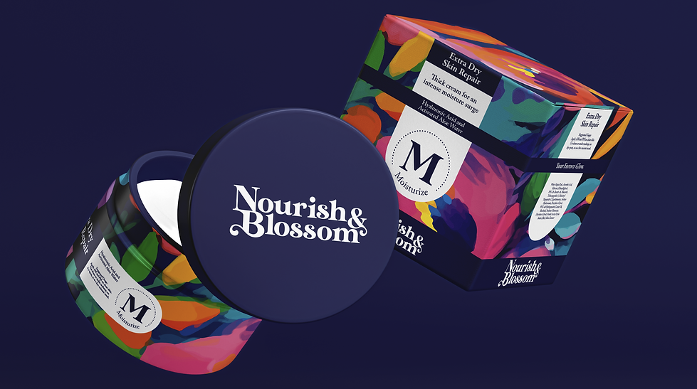
Packaging design
The packaging had to do two things at once — stand out on shelf and feel cohesive as a set. The floral motif carries across every SKU, but color accents differentiate by product category, so a customer can build a routine and immediately understand how the pieces relate to each other.
Bold serif typography keeps the hierarchy clear even at small sizes, and the layout prioritizes what the customer actually needs to know — benefits and ingredients — without cluttering the visual field. The structure of each package was also chosen to fit the specific product format, so form and function stayed in conversation throughout.


Website design
The site needed to convert browsers into buyers without losing the brand's elevated feel. The navigation is intentional — Shop, Best Sellers, and the Skincare Quiz are the three things a new customer needs, and they're the three things that are immediately visible.
The Skincare Quiz was a deliberate brand decision, not just a UX feature. It positions Nourish & Blossom as a guide rather than a vendor, which is central to the brand's relationship with its customer. Product imagery is large and clean, letting the packaging design carry the page rather than competing with it.

Shipping Experience
The brand doesn't end at purchase. The shipping box uses the floral system from the packaging, so the moment a customer opens their door the brand is already present. The cosmetic bag included with orders was designed as a functional keepsake — something worth keeping, which means the brand stays in the customer's life long after the product is gone.
These weren't afterthoughts. They were part of the same system, held to the same visual standard.


Social Ads
The social creative pulls directly from the packaging system — same florals, same color logic, same typographic voice — so the brand is recognizable the moment it appears in a feed. The copy is short and direct: "Pure Simplicity for Your Skin" isn't a tagline, it's the brand's entire philosophy compressed into five words.
Where models were used, the styling stayed inside the brand world — florals, natural light, confidence without performance. The goal was ads that felt like an extension of the brand, not interruptions of it.


